The Secret Language of Color and Landscape Photography
As a graphic designer, I use my knowledge of the power of color to create designs that emotionally provoke. For example, if I were designing a logo for a company that provides spa services, I would use colors that are known to have a calming effect, like green or light blue. I wouldn’t use red, because red is known to excite and can even increase blood pressure and heart rates. We associate red with passion and excitement, so using red in a design promoting a nightclub would be a great color choice. As a landscape photographer, I apply these same learned principles of color psychology to my images.
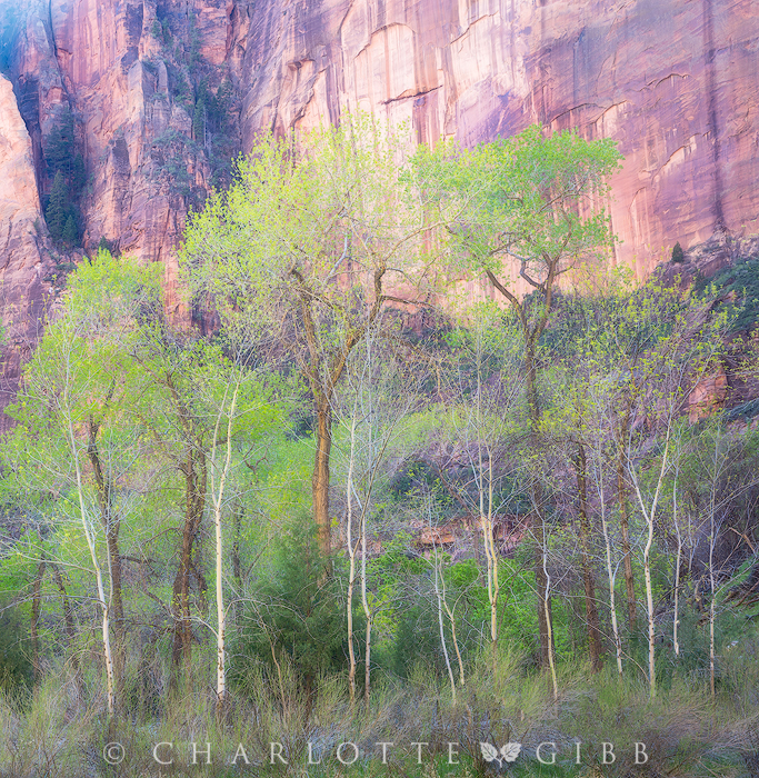
Understanding how color works and how we emotionally respond to certain colors and color combinations has helped me make more effective images. The photo above, for instance, was made in the late Fall in the Eastern Sierra of California. The light in the overall scene was flat and a little warmer than what you see in this final image. This grove of Aspens, lacking the typical Autumn foliage, looked lacy to my eye, and I wanted my final image to have a delicate and distinctly feminine feel, so rather than warming up the image with yellow and red, which would have been bolder and more masculine, I chose to go the other way, accentuating the pinks and the cool tones.
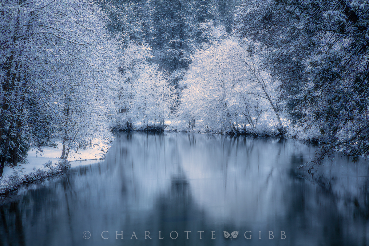
Blue
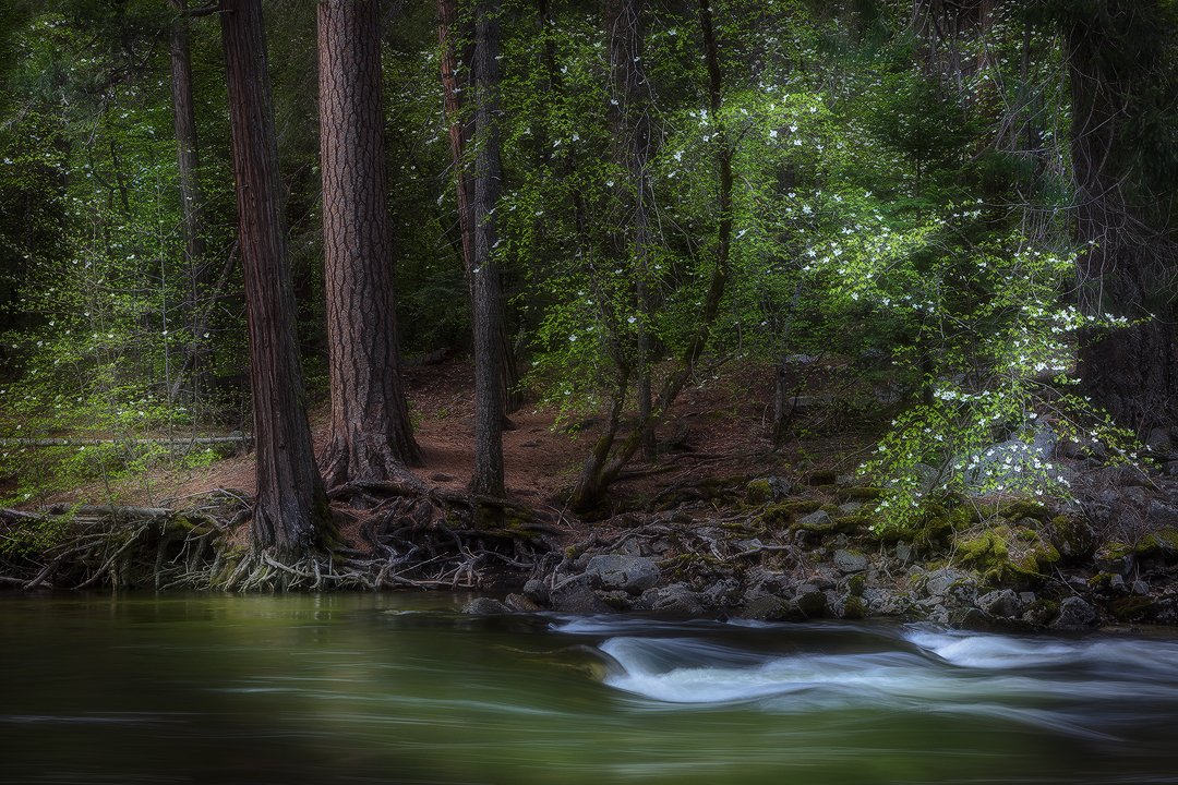
The photograph above was made during the “blue hour” — that magical time just before dawn or just after sunset when the light is faint and everything appears to be blue. Blue evokes feelings of peace and serenity, so while it might have been tempting to convert this monochromatic image to black and white, I wanted to accentuate the peaceful feeling of this pre-dawn scene, and so I left the natural blue because it helps to drive home that idea.
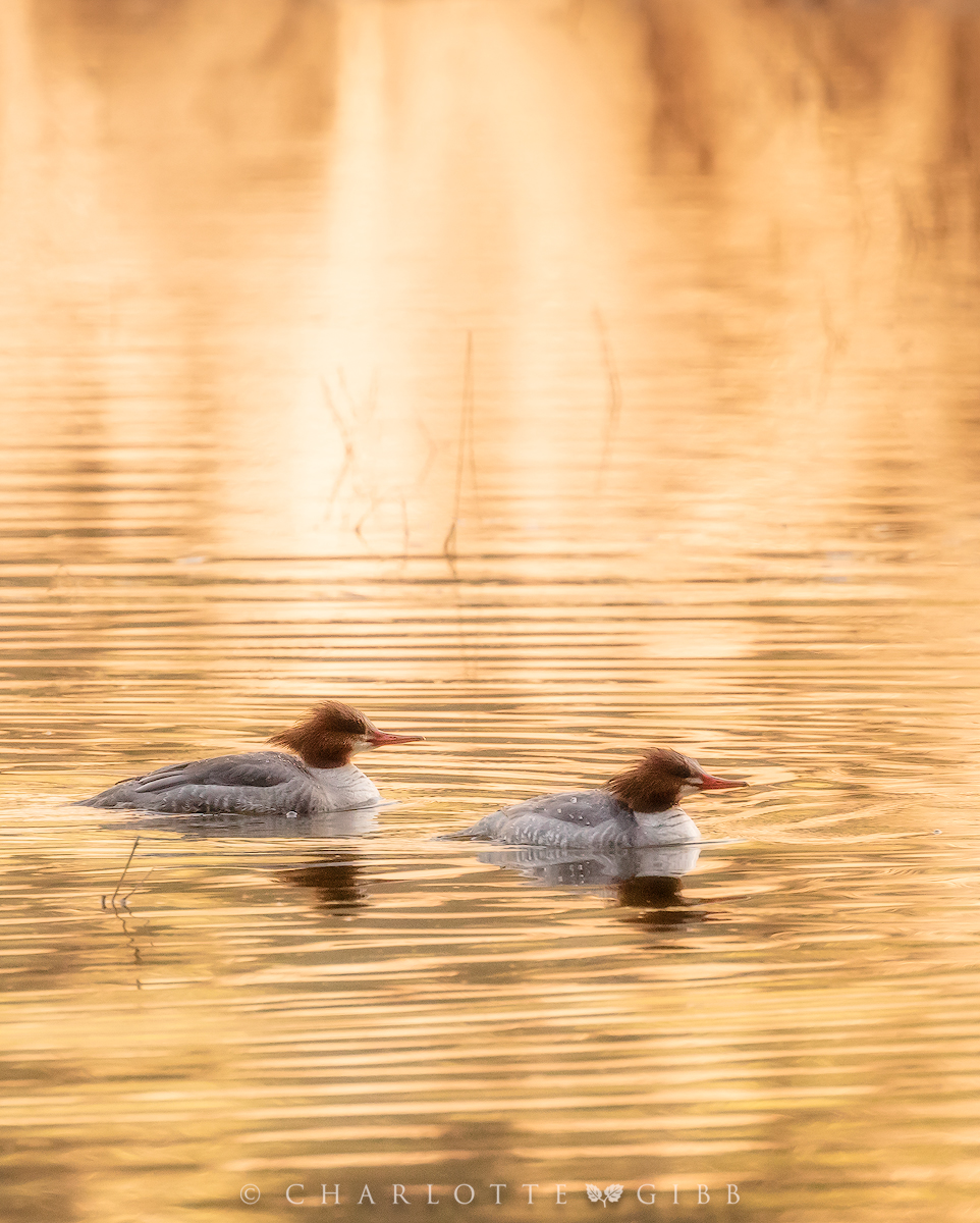
Yellow
Yellow is a happy color, full of youthful energy and optimism. These Mergansers appeared to have identical grins on their beaky faces, adding to the overall cheeriness of the image.
Color psychology is a deep subject, and although this article is intended to offer just a brief glimpse at the topic, I wrote an in-depth on the emotive properties of color for Visual Wilderness, an online learning resource for landscape photographers. You can read the article here.